

AdPicker Logo Design Process
![]()
All large companies such as Apple, Google and Coca Cola have something in common. Their successful logos are simple and eye catching. They always have subtle references relating to their product/view. Designing a small visual representation of an entire company is a frustrating but rewarding process.
Understanding the company’s goals
AdPicker is the Next Generation Content Keyword Advertising which automatically picks up keywords from website contents and turns it into a tappable link. As this is difficult to describe, it is even more difficult to advertise visually.
This project was under development before any branding or designs were created. This opened up a lot of freedom to experiment and to focus on the demographic. Keywords, targeting, advertising and future technology are the main words AdPicker wants to focus on. This gave us a good foundation to begin designing.
Draft Production
As we already had the project name, it was easy to go right into potential drafts. Each designer obviously has their own work flow. Some companies prefer to start with simple sketches and drawings to think of some ideas, whereas I personally prefer to go straight into using Illustrator/Photoshop to start getting a small glimpse of some possible final outcomes. Taking the keywords from before while incorporating the name ’AdPicker’, some basic designs were created.
It was important to learn where the logo will be used, this is vital when choosing colours and fonts. Is the logo going to be placed on letter heads?, Banners?, different colour backgrounds? All of these questions needed to be taking in to consideration when coming up with designs.
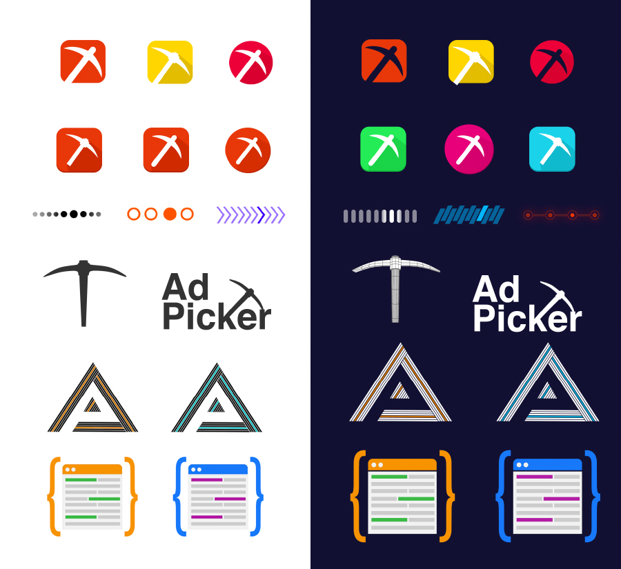
After many discussions, the logo was decided to be focused on the selecting aspect. Working from top down, the picker was an obvious choice for the logo as it represents mining out keywords. The next is a selection / loading element which went on to be the final design. This worked so well as the highlight element stood out so well and really focused in on keyword. The following 2 designs were instantly ruled out as the just didn’t suit the future style we were looking for. Finally, the last idea actually went on to be used throughout the website as a instructing guidance image. This design is more of a visual reference/guide that really helped to visual explain the product. Seeing as this was created with the idea of being a logo, it is good to keep in mind that you may expand your assets/knowledge accidentally while experimenting different ideas.
Stand back and decide
After many different designs and colour palettes being created, we focused on the 2 ‘styles’ of logos we preferred. It is always difficult to balance personal visual interest with making sure the message you are trying to portray is still getting across. In order to overcome this, we tried many different styles that were very similar, only changing certain elements, fonts or colours.
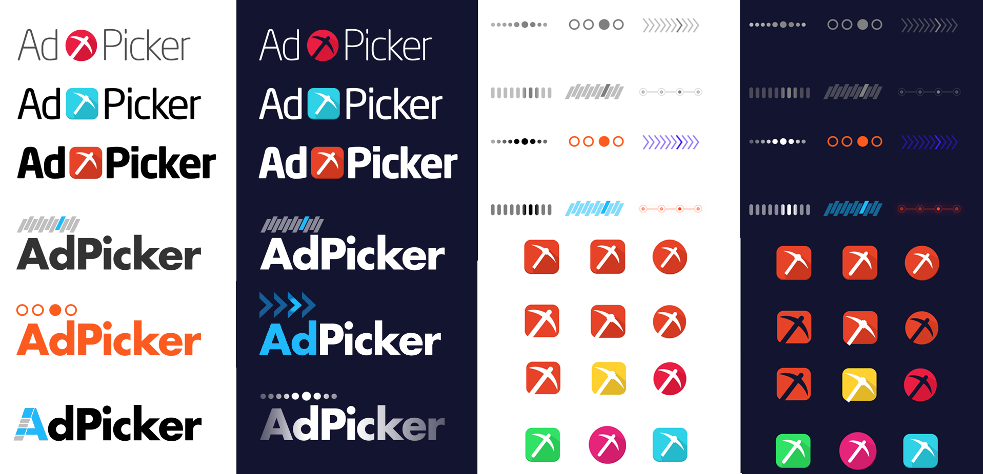
From looking at all of the different icons and logo ideas that have been created it was easy to start to see what worked and what did not work. From here we started to go with eliminating the logos we really felt were just not working. After looking continuously at power point presentations and flat images, we took the designs to mock up stock images to give a more real life view of what the product could look like. This gave us a greater view on the comparisons of each design.
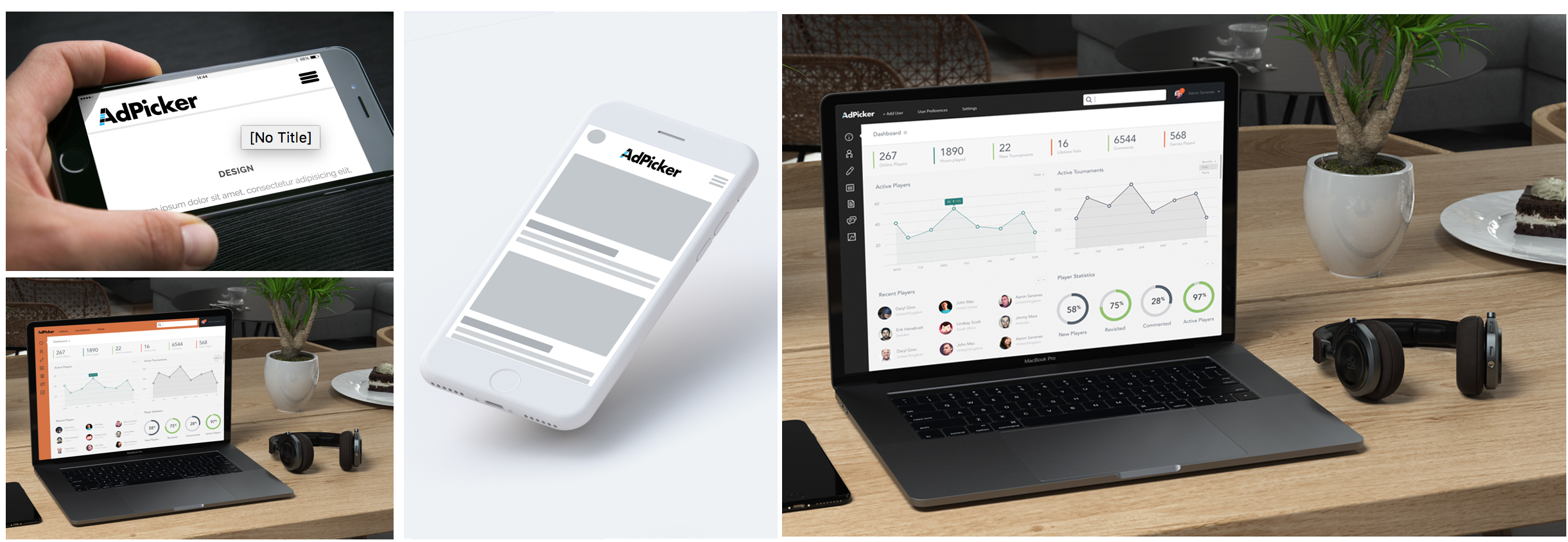
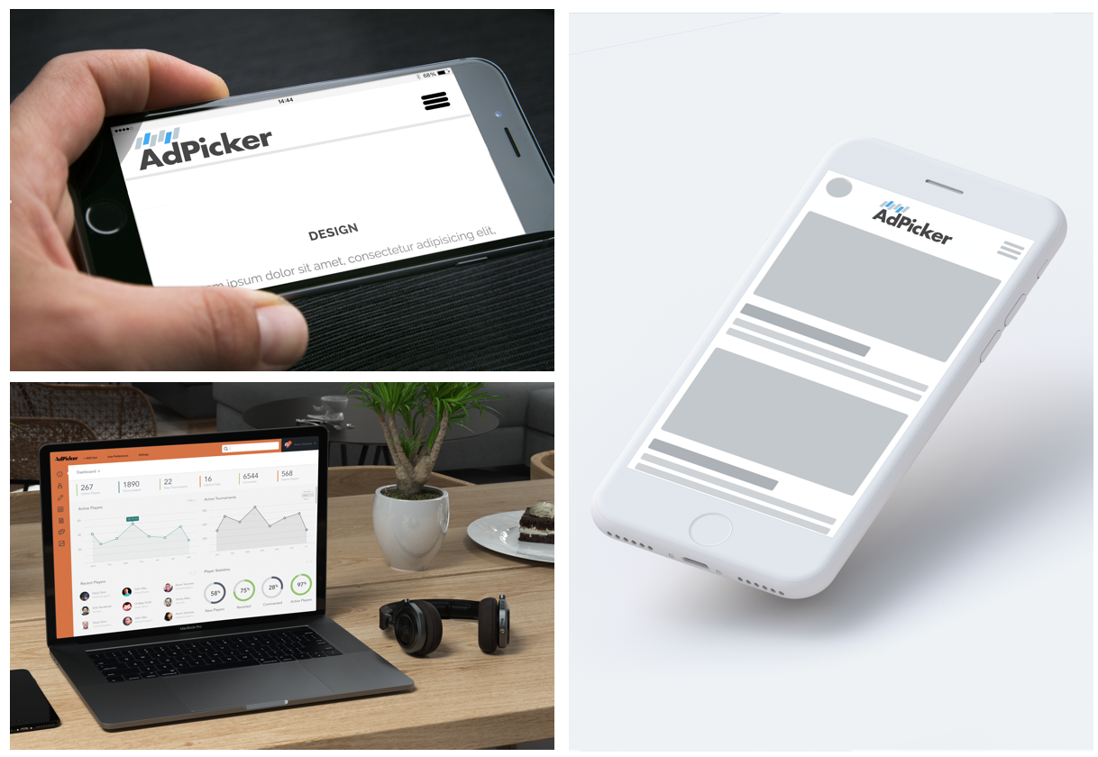
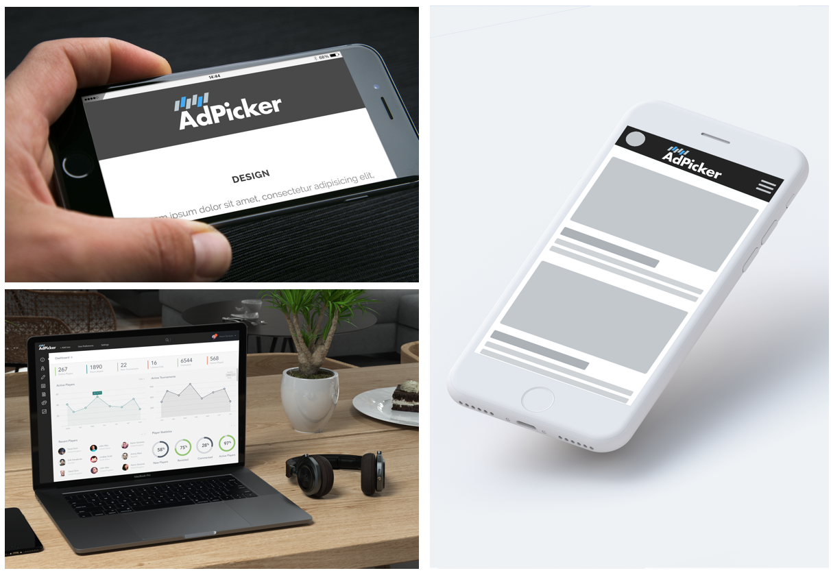
As you can see, this does not only give the designs a real life example of the final product, but it also gives the logo a more professional feel. Whether working for a client or in a company it is always important to try and show the final result as this will save a lot of time in the re-designing phase. This was all created by using simple free stock images and using the latest Photoshop Perspective tool.
This technique also substantially helps with confirming the chosen colours are going to work with the product itself. AdPicker’s main two placements where it will be visible is the AdPickers Website itself and the Main client Dashboard.
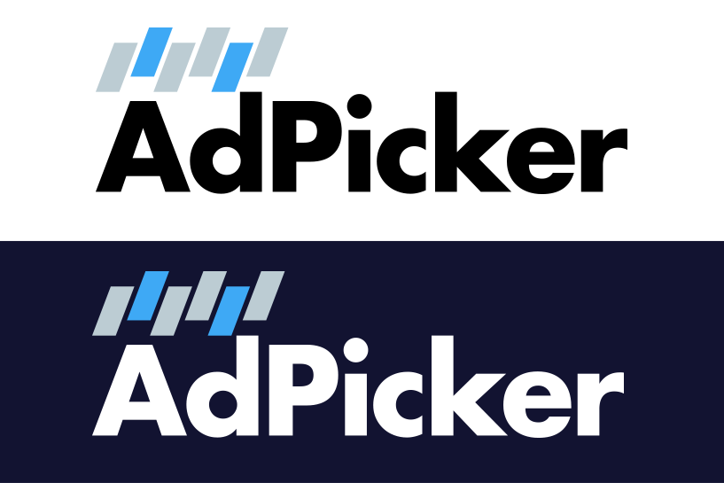
Finally the 5 selectors Adpicker was chosen as this seemed to not only suit the Dashboard and Website design, but it also hit all of the key elements that we wanted AdPicker to show.
Detail creation of AdPicker Logo
We eventually started to call the icon section “selectors”. This was the keyword we wanted to incorporate when discussing key word selectors icon design. Because the brand name itself is already highlighting the ‘Picker’ section, the icon helped to show a more specific precise selection by using a variety of choices, thus becoming selectors. 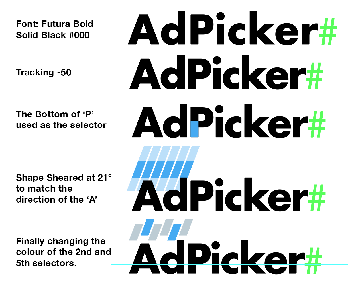
My personal preference when creating logo designs is to keep the size and shape of any element used and replicate it throughout the logo. This gives a sense of symmetry and balanced perspective over all. From top to bottom, the first step was to create AdPicker text using Futura Font. Next we changed the tracking to -50 to make the logo look more condensed. After this we took the section of the Capitalized P and used this for the size and width of each selector. We then sheared the selector by 21° which matches the same direction as the Capitalized A. Finally we alternated the position and changed the 2nd and 5th selectors to the primary AdPicker Colour. The reason for the 2nd and 5th is to show the specific selection process of keywords. This process was used across all of the potential final AdPicker Logo ideas. Not only does this help keep everything looking precise, it also gives a sense of creative thinking during the process.
Conclusion
Even after the creation of the logo had been released there is always doubt and reconsiderations of how and what could have been done differently, however the most important aspect of a logo is to be clear and recognizable which was achieved at the end of the project. Take a look at some more pictures of the final logo or visit our website – http://adpicker.net/.